


Quantum Scale Package Design
THE CREATIVE CHALLENGE:
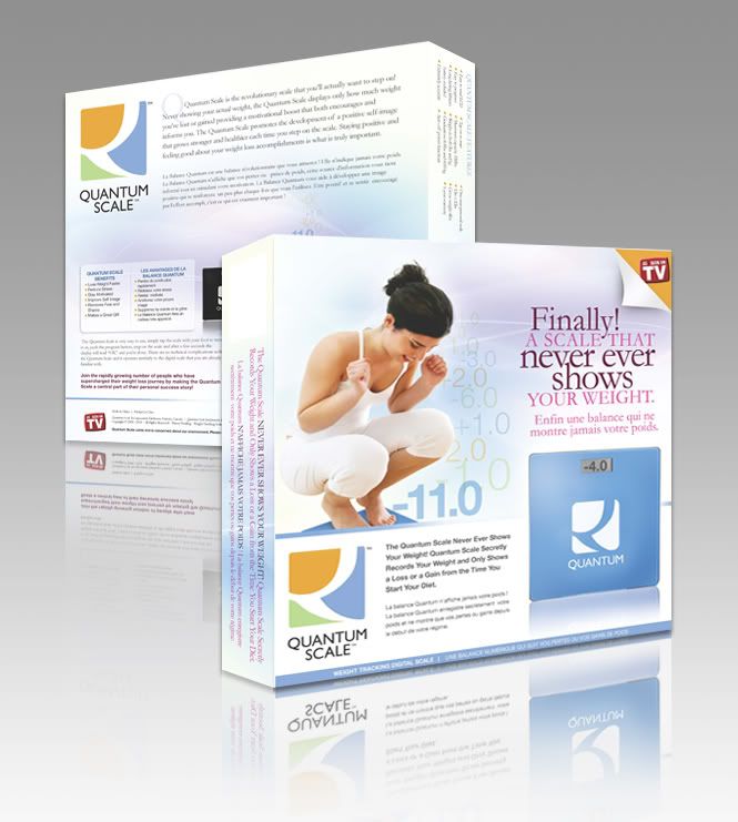
Quantum Scale needed a box for their product. It needs to be eye-catching and should illustrate how the scale works. Most of the people have a hard time understanding how Quantum Scale functions since it never shows your actual weight, just how much you lose or gain.
THE SOLUTION:
The solution was actually visually simple. I created a set of floating numbers (-11.0, -1.0, -2.0. -2.0…) and placed it beside a girl weighing herself. It instantly gives people an idea what the scale actually shows. The product shot also displays “-4.0” instead of the usual weight in kilograms or pounds.
2010 Comeback
After a year of laying low on mainstream graphic design and focusing on my newborn, I’m ready for more creative challenges. To kick off my comeback last November 2009, business cards were created for Jack as a surprise gift for his girlfriend.
THE CREATIVE CHALLENGE:
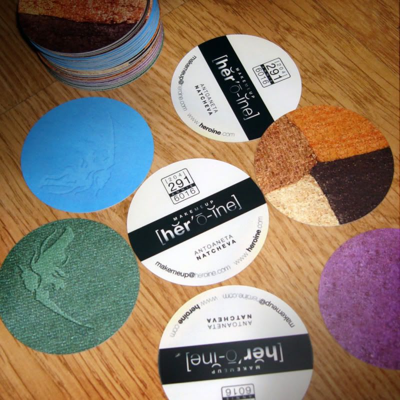
Annie works as a make up artist for MAC Cosmetics but wants to do some freelance works thus the need for business cards. For her company name, she wants either heroine or lipstick but written in dictionary style, but not necessarily keeping the accents accurate. She likes a card that is smaller than the normal one like a strip for perfume samples.
THE SOLUTION:
Since the client left most of the decision making on me, I chose “heroine” because it makes more sense than lipstick. She is like a super hero with the powers of make up (according to the client). I just played around with fonts, keeping it sleek like a make up label. Since this is a card for a make up artist, it had to be clearly understood by the recipient so there had to be some sort of label or tagline. This one was a challenge because “make up artist” was already over-used, “make up” would make it look like a cosmetic line and the client wanted to use minimal words for tagline as much as possible. I decided to insert “me ” between “make up” making it Make Me Up. It’s like the recipient saying, “Make me up, heroine”. The client loved it and so did I.
IDEA 1: Business card/Portfolio. It’s a great way for prospect clients to immediately see her works (or at least one of her works.)
2″X2″, 2-sided card with three round corners.
The client wanted to included the fairy drawing done by Annie so I converted it to vector and made it part of the logo. The 3 round corners was actually suggested by Jack because he thought it was poetic to think of Annie, how she is soft and well-rounded but she is to the point.

IDEA 2: This is a 2″ in diameter businesscards which will look like eyeshadow refills. At the back, I made it look (as close as possible) like the labels at under the make up cases. They usually have color codes so I used that format for the contact number.
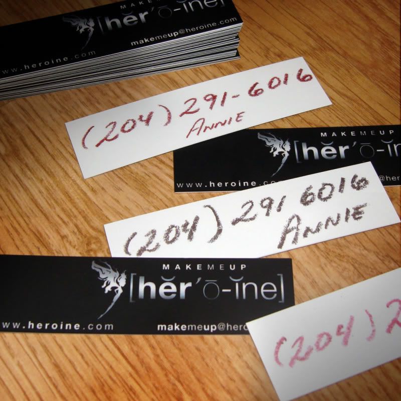
IDEA 3: I really like the idea of the perfume strip size for a businesscard so I thought, why not use an actual one )? I wanted to make it look as if she has a bunch kept in her purse. She comes across a prospect and decided to give out her contact number. Unfortunately, she got no pen. But she will always have an eye liner, lip liner, lipstick or even a lip gloss available to use as a pen! It was Annie’s actual handwriting that was used for the contact number.

Other Older Projects
Easy Mail Maker Brochure
Dimension: 6″ x 6″, 6 pages

ExpertsOnline.tv Brochure
(Print and PDF Downloadable Brochure)
Dimension: A4, 12 pages

SEO Club Exclusive Brochure
(PDF Downloadable Brochure)
Dimension: 10″x7″, 5 pages


Recent Comments